pacman::p_load(ggstatsplot, ggthemes, plotly, corrplot, lubridate, ggpubr, plotly, treemap, hrbrthemes, ggrepel, RColorBrewer, gganimate, viridis, ggridges, ggrepel, testthat, hmisc, tidyverse, skimr, DT, ggiraph, ggplot2, dplyr, broom)Exploring City of Engagement’s household demographic and spending patterns
Take Home Exercise 1
Background
The City of Engagement is utilizing the survey data to shape its community revitalization plans, specifically with the aim of maximizing the impact of a recently acquired substantial city renewal grant.
Task
To help the city effectively allocate resources towards significant community development initiatives, we need to offer valuable insights into household demographics and hidden patterns by analyzing survey data.
Load Packages
View financial journal dataset
Financial journal dataset includes financial transactions made by 1010 participants, including wage, shelter, education, recreation, food from the period of March 2022 to February 2023.
financialjournal <- read_csv("Take-home_Ex01/FinancialJournal.csv")glimpse(financialjournal,30)Rows: 1,513,636
Columns: 4
$ participantId <dbl> 0, 0, …
$ timestamp <dttm> 2022-…
$ category <chr> "Wage"…
$ amount <dbl> 2472.5…DT::datatable(head(financialjournal,20), class = "display")Data Preparation - Financial journal
Prior to conducting data analysis and visualization, it is crucial to engage in data preparation procedures to guarantee the cleanliness, organization, and suitability of the data for analysis purposes. Presented below are data preparation steps.
Step 1: Sort the data by participantId
Show code
##sort the dataset by participantid
financialjournal <- financialjournal[order(financialjournal$participantId),]
Step 2: Check missing values
##check missing values
colSums(is.na(financialjournal))
participantId timestamp category amount
0 0 0 0 Step 3: Check any duplicates records
1113 rows of duplicates were found.
##check for duplicates
dup_rows <- duplicated(financialjournal)
financialjournal[dup_rows, ]
# A tibble: 1,113 × 4
participantId timestamp category amount
<dbl> <dttm> <chr> <dbl>
1 0 2022-03-01 00:00:00 Shelter -555.
2 0 2022-03-01 00:00:00 Education -38.0
3 1 2022-03-01 00:00:00 Shelter -555.
4 1 2022-03-01 00:00:00 Education -38.0
5 2 2022-03-01 00:00:00 Shelter -557.
6 2 2022-03-01 00:00:00 Education -12.8
7 3 2022-03-01 00:00:00 Shelter -555.
8 3 2022-03-01 00:00:00 Education -38.0
9 4 2022-03-01 00:00:00 Shelter -1556.
10 4 2022-03-01 00:00:00 Education -12.8
# ℹ 1,103 more rowsStep 4: Remove duplicates
After removing duplicates, the dataset now comprises 1010 unique participants with a total of 1512523 records.
Show code
##remove duplicates
financialjournal_distinct <- unique(financialjournal)
Step 5: Transform Time into Year, Month
Show code
##Split the timestamp into date and time
financialjournal_distinct[c('Date', 'Time')] <- str_split_fixed(financialjournal_distinct$timestamp, ' ', 2)

financialjournal_distinct[c('Year', 'Month', 'Day')] <- str_split_fixed(financialjournal_distinct$Date, '-', 3)

##Drop timestamp, time and day of the date
financialjournal_distinct <- subset(financialjournal_distinct, select = -c(Time, timestamp, Day))
Step 6: Data aggregation on amount by year and month
Show code
df <- financialjournal_distinct

aggregated <- aggregate(amount ~ participantId + category + Year + Month, data = df, FUN =sum)

aggregated <- aggregated[order(aggregated$participantId,aggregated$category, aggregated$Year,aggregated$Month),]
Step 7: Pivot table - one participant one record
Show code
pivot_table <- pivot_wider(aggregated, names_from = category, values_from = amount, values_fill = 0)View Participants table
Participants dataset provides valuable information on the demographic and characteristics of City of Engagement residents who voluntarily participated in the study. It encompasses participant IDs, household size, whether participants have children or not, age, education level, interest group, and self-reported joviality level, shedding light on a range of important factors related to the participants’ profiles and experiences.
participants <- read_csv("Take-home_Ex01/Participants.csv")glimpse(participants,30)Rows: 1,011
Columns: 7
$ participantId <dbl> 0, 1,…
$ householdSize <dbl> 3, 3,…
$ haveKids <lgl> TRUE,…
$ age <dbl> 36, 2…
$ educationLevel <chr> "High…
$ interestGroup <chr> "H", …
$ joviality <dbl> 0.001…DT::datatable(head(participants,20), class = "display")Data preparation - Participants
Check missing values
colSums(is.na(participants)) participantId householdSize haveKids age educationLevel
0 0 0 0 0
interestGroup joviality
0 0 Merge two tables by participantId
merged_table <- merge(pivot_table, participants, by = "participantId")glimpse(merged_table,30)Rows: 10,691
Columns: 15
$ participantId <dbl> 0, 0,…
$ Year <chr> "2022…
$ Month <chr> "03",…
$ Education <dbl> -38.0…
$ Food <dbl> -268.…
$ Recreation <dbl> -348.…
$ Shelter <dbl> -554.…
$ Wage <dbl> 11931…
$ RentAdjustment <dbl> 0, 0,…
$ householdSize <dbl> 3, 3,…
$ haveKids <lgl> TRUE,…
$ age <dbl> 36, 3…
$ educationLevel <chr> "High…
$ interestGroup <chr> "H", …
$ joviality <dbl> 0.001…Change Data Type
participantId, year and month should treat as character
Show code
merged_table$participantId <- as.character(merged_table$participantId)
merged_table$Year <- as.character(merged_table$Year)
merged_table$Month <- as.character(merged_table$Month)
Create new variables and grouping
New variables: “Savings”, “Total Expense” and “Date”
To see if we get catch any additional information or pattern in the dataset, we will create two new variables:
Savings = Wage + Shelter + Education + Food + Recreation + RentAdjustment Total_Expense = Shelter + Education + Food + Recreation + RentAdjustment Date: “Year”-“Month” (e.g. 2022-03)
Show code
merged_table <- merged_table %>%
  mutate(Savings = Wage + Shelter + Education + Food + Recreation + RentAdjustment, Total_Expense = Shelter + Education + Food + Recreation + RentAdjustment)

merged_table$Date <- paste0(merged_table$Year, "-",merged_table$Month)
New grouping: age_group, wage_group, savings_group
To explore patterns, trends or relationships across different group more easily. We create following three groupings: age_group: break into 6 groups. 18-25, 25-32, 32-39, 39-46, 46-53, 53-60 wage_group: break into 5 groups. Super low, low, medium, high, super high savings_group: break into 5 groups. Super low, low, medium, high, super high
Show code
age_ranges <- c(18, 25, 32, 39, 46, 53,60)
labels <- paste(age_ranges[-length(age_ranges)], age_ranges[-1], sep = "-")
merged_table$age_group <- cut(merged_table$age, breaks = age_ranges, include.lowest = TRUE,labels = labels)
wage_ranges <- c(1600.00, 5546.93, 9493.86, 13440.79, 17387.72, 21334.65)
group_names <- c("super low", "low", "medium", "high", "super high")
merged_table$wage_group <- cut(merged_table$Wage, breaks = wage_ranges, include.lowest = TRUE, labels = group_names)
savings_ranges <- c(-362.7011,3672.3091,7707.3193,11742.3296,15777.3398,19812.3500)
merged_table$savings_group <- cut(merged_table$Savings, breaks = savings_ranges, include.lowest = TRUE, labels = group_names)
Financial Health distribution over time
To see the overall average savings overtime, we calculate the average savings by month. From dot plot, March stands out as the month with the highest financial savings compared to the other months, our suspicion is that this occurrence is attributed to participants receiving a bonus during March.
merged_table_financial <- merged_table %>%
  select(Date, Savings) %>%
  group_by(Date) %>%
  summarise(average_savings = mean(Savings)) %>%
  ungroup()

p <- ggplot(merged_table_financial, aes(x = Date, y = average_savings)) +
  geom_point()+
  labs(x = "Month", y = "Savings", title = "Average savings from 2022.03 - 2023.02")

ggplotly(p)
Correlation plot
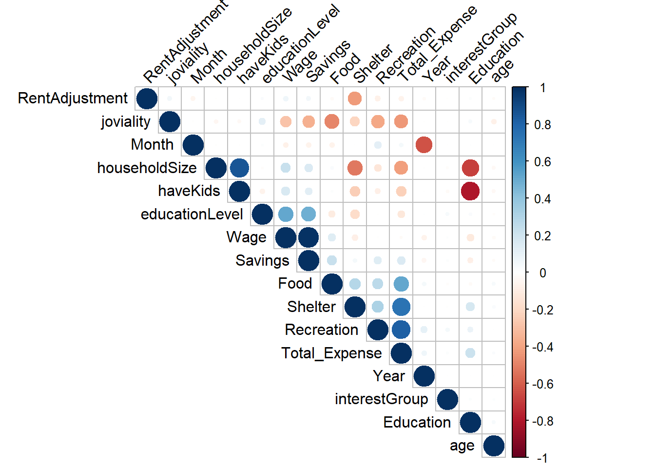
We need to determine the correlation between various factors to identify their strength of association. Specifically, factors such as having kids, household size, and education exhibit a strong negative relationship. Additionally, joviality, food, savings, and recreation demonstrate a negative relationship. In our subsequent analysis, we will delve into these features for further exploration.
## Convert characters to numeric, so that we can do correlation matrix

merged_table_test = merged_table
merged_table_test$Year <- as.numeric(merged_table_test$Year)
merged_table_test$Month <- as.numeric(merged_table_test$Month)

merged_table_test <- merged_table_test %>%
  mutate(educationLevel = recode(educationLevel,
                                 "Low" = 1,
                                 "HighSchoolOrCollege" = 2,
                                 "Bachelors" = 3,
                                 "Graduate" = 4))
merged_table_test <- merged_table_test %>%
  mutate(interestGroup = recode(interestGroup,
                                "A" = 1,
                                "B" = 2,
                                "C" = 3,
                                "D" = 4,
                                "E" = 5,
                                "F" = 6,
                                "G" = 7,
                                "H" = 8,
                                "I" = 9,
                                "J" = 10))
merged_table_test <- subset(merged_table_test, select = -c(participantId, age_group, Date, wage_group, savings_group))


correlation <- cor(merged_table_test)

corrplot(correlation,type = "upper", order = "hclust",
         tl.col = "black", tl.srt = 45)
Financial Health
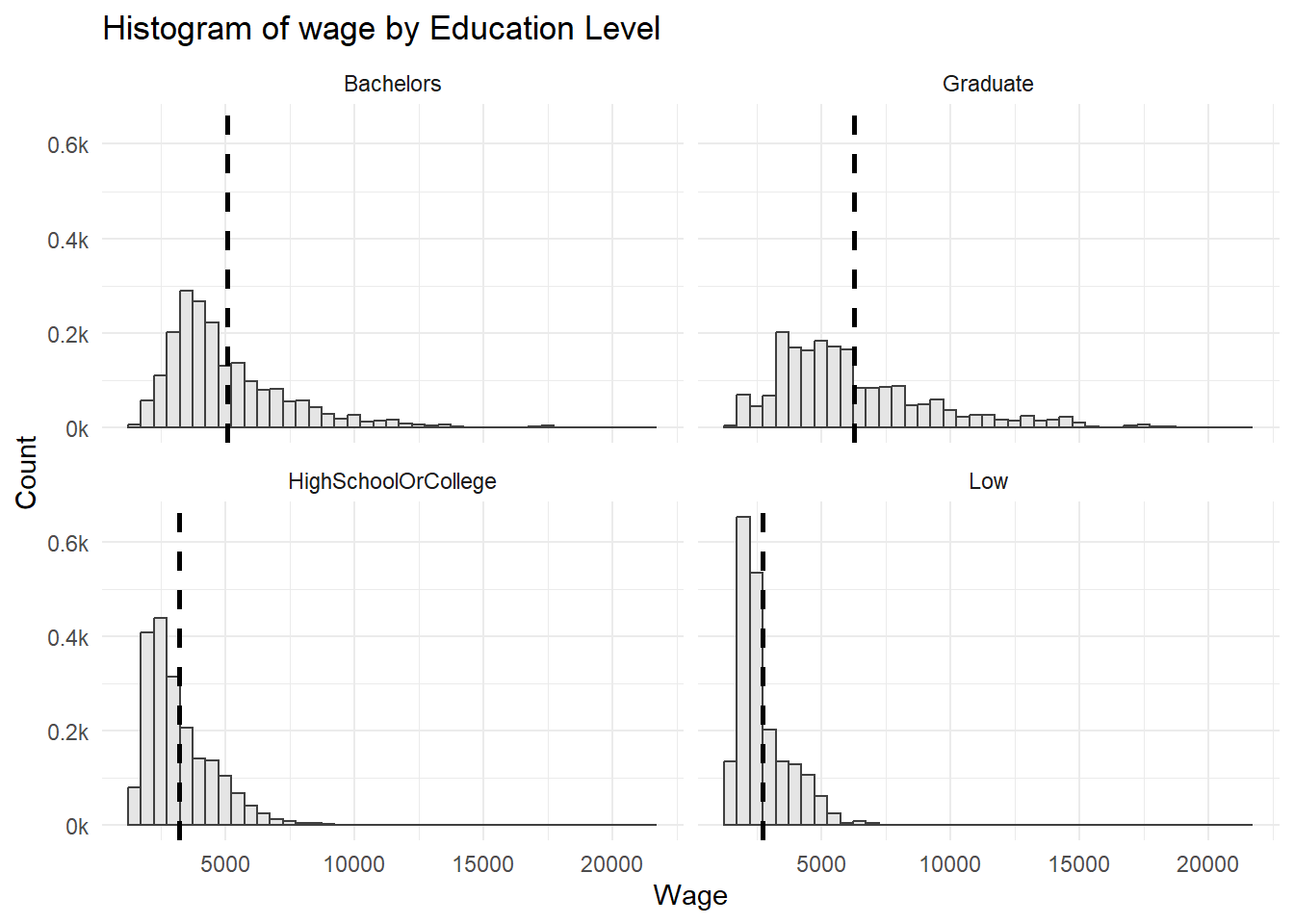
Wage vs. Education level
The distribution across education levels are all right-skewed. ::: panel-tabset ## The plot
Code
summary_merged_table <- merged_table %>%
  group_by(educationLevel) %>%
  summarise(mean_wage = mean(Wage), sd_wage = sd(Wage))

ggplot(merged_table, aes(x = Wage)) +
  geom_histogram(aes(y=..density..), binwidth = 500, color = "grey25", fill="grey90") +
  scale_y_continuous(labels = function(x) paste0(x*1000, "k")) +
  labs(x = "Wage", y = "Count")+
  ggtitle("Histogram of wage by Education Level")+
  geom_vline(data = summary_merged_table, aes(xintercept = mean_wage),
             linetype = "dashed", size = 1) +
  facet_wrap(~ educationLevel, ncol = 2)+
  theme_minimal()
:::
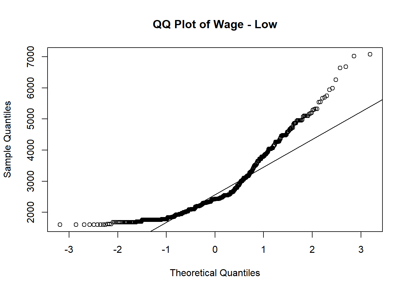
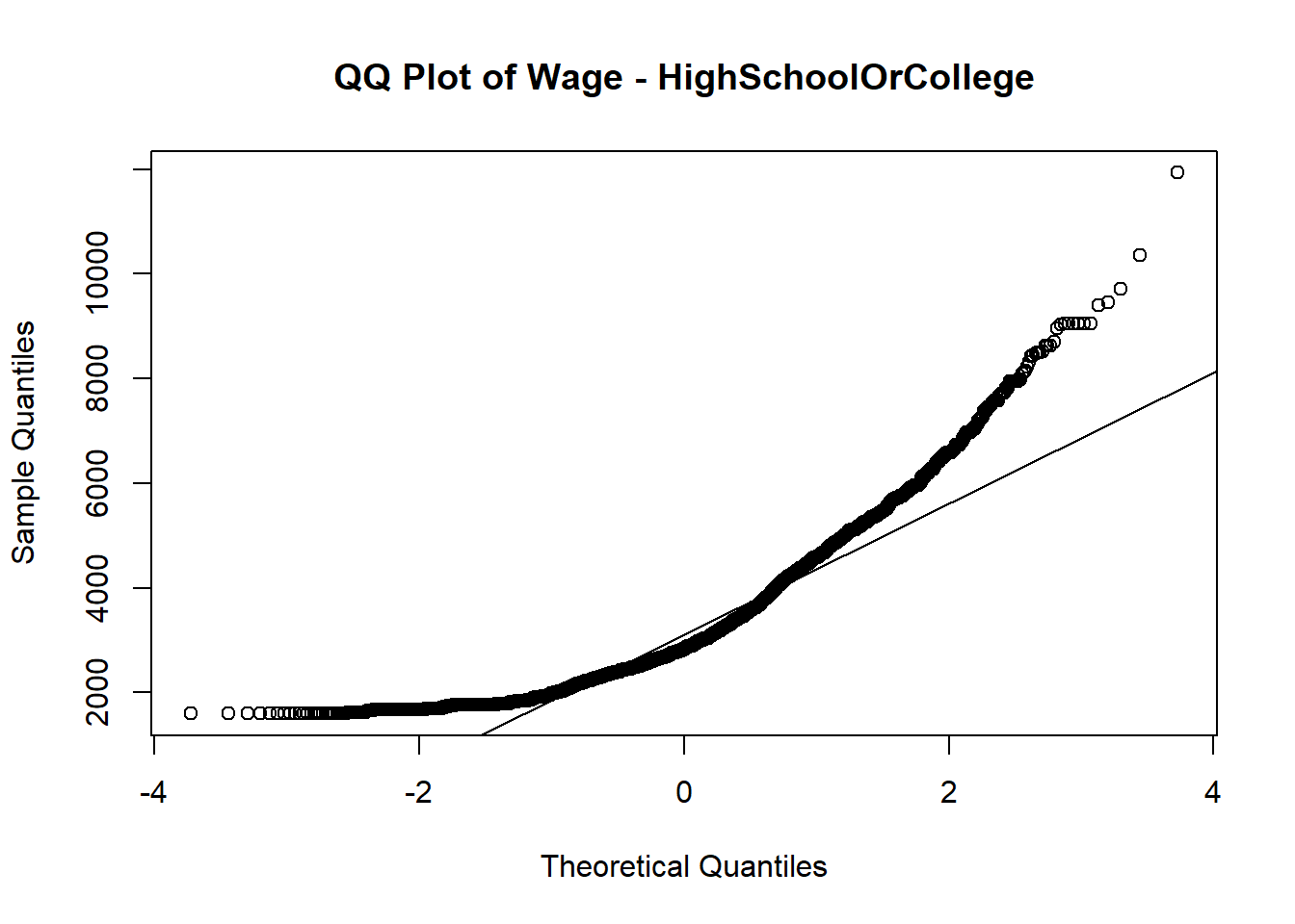
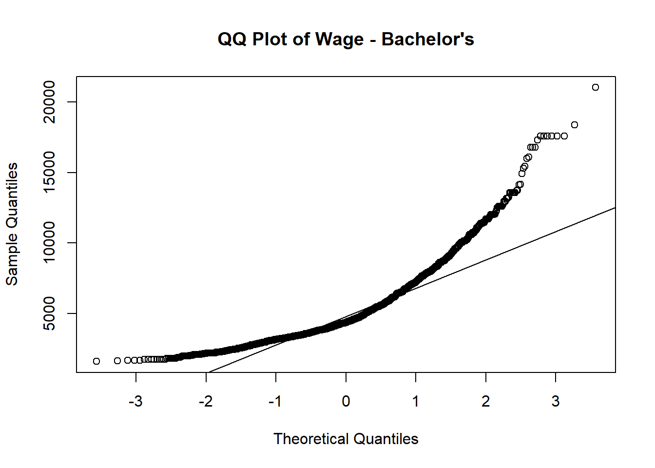
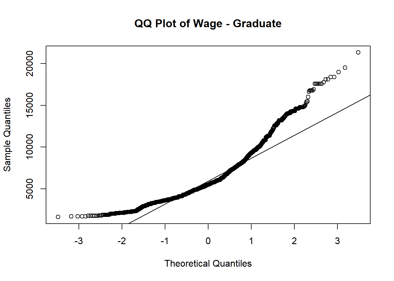
Normal QQ plot is used to verify whether wage follows normal distribution among different education level.
Out of 4 QQ plots, the tails of the distribution start deviating from the normal distribution line, which suggests that there are outliers or extreme values in each education level.
# Subset the data for a specific education level
subset_data_bachelor <- subset(merged_table, educationLevel == "Bachelors")

# Check if the subsetted data contains valid values
if (any(is.na(subset_data_bachelor$Wage)) || nrow(subset_data_bachelor) == 0) {
  print("Subsetted data is empty or contains missing values.")
} else {
  # Create the QQ plot of savings for the subsetted data
  p1 <- qqnorm(subset_data_bachelor$Wage, main = "QQ Plot of Wage - Bachelor's")
  qqline(subset_data_bachelor$Wage)
}

# Subset the data for a specific education level
subset_data_low <- subset(merged_table, educationLevel == "Low")

# Check if the subsetted data contains valid values
if (any(is.na(subset_data_low$Wage)) || nrow(subset_data_low) == 0) {
  print("Subsetted data is empty or contains missing values.")
} else {
  # Create the QQ plot of savings for the subsetted data
  qqnorm(subset_data_low$Wage, main = "QQ Plot of Wage - Low")
  qqline(subset_data_low$Wage)
}

subset_data_graduate <- subset(merged_table, educationLevel == "Graduate")

# Check if the subsetted data contains valid values
if (any(is.na(subset_data_graduate$Wage)) || nrow(subset_data_graduate) == 0) {
  print("Subsetted data is empty or contains missing values.")
} else {
  # Create the QQ plot of savings for the subsetted data
  qqnorm(subset_data_graduate$Wage, main = "QQ Plot of Wage - Graduate")
  qqline(subset_data_graduate$Wage)
}

subset_data_highschool <- subset(merged_table, educationLevel == "HighSchoolOrCollege")

# Check if the subsetted data contains valid values
if (any(is.na(subset_data_highschool$Wage)) || nrow(subset_data_highschool) == 0) {
  print("Subsetted data is empty or contains missing values.")
} else {
  # Create the QQ plot of savings for the subsetted data
  qqnorm(subset_data_highschool$Wage, main = "QQ Plot of Wage - HighSchoolOrCollege")
  qqline(subset_data_highschool$Wage)
}
Since it’s not normal distributed based on above QQ plots, we need to perform nonparametric test (Kruskal-Wallis) to perform the hypothesis testing.
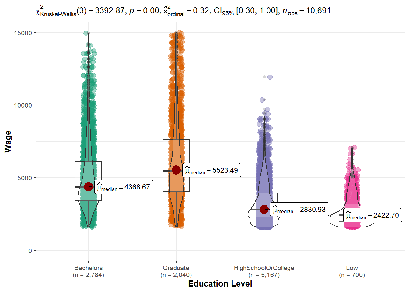
Hypothesis assumptions:
H0: there is no difference between wage across education levels
H1: there is difference between wage across education levels
From violin plot, it suggested that p-value is less than 0.05. We reject the null hypothesis, and fail to reject alternative hypothesis.
Conclusion: There is wage difference across education.
One-way ANOVA analysis
To check how much difference is it between each education level pairing, one-way anova is performed.
ggbetweenstats(data = merged_table,
               x = educationLevel, y = Wage,
               xlab = "Education Level", ylab = "Wage",
               type = "np", pairwise.comparisons = TRUE, pairwise.display = "ns",
               mean.ci = TRUE, p.adjust.method = "fdr",
              messages = FALSE) +
  scale_y_continuous(limits = c(0, 15000))
As expected, graduate has the highest wage, followed by bachelors, highschool or college and Low. The wage difference between graduate and low is the hugest.
Tukey’s test
To determine if there are significant differences between the means of education levels after conducting an ANOVA, Tukey’s test is applied.
In summary, the Tukey’s test results indicate significant differences in the means between various groups. Here are the key findings:
- “Low” have a significantly lower mean compared to “Graduate” participants, with a mean difference of -3565.5254.
- “Graduate” have a significantly higher mean compared to “Bachelors” participants, with a mean difference of 1191.6695.
The p-values for all comparisons are reported as 0, indicating that the observed differences are statistically significant. The 95% confidence intervals for the mean differences do not include zero, further supporting the significant differences between the groups.
anova_result <- aov(Wage ~ educationLevel, data = merged_table)

# Perform Tukey's post hoc test for pairwise comparisons
tukey_result <- TukeyHSD(anova_result)
tukey_result
tukey_summary <- tidy(tukey_result)

DT::datatable(head(tukey_summary, 20))
Financial Health vs. Education vs. have Kids
To compare the financial health across education levels by haveKids, interactive boxplots are computed to have a detailed look on their average savings in each education level.
From above comparisons and graphs plotted in terms of financial health, it is evident that there exists a positive correlation between education and both income and financial well-being among individuals. As education level increases, there is an associated improvement in financial health. Additionally, it is observable that individuals with higher financial well-being tend to have children.
plot_ly(
  data = merged_table |> filter(haveKids == "TRUE"),
  y = ~Savings,
  type = "box",
  color = ~educationLevel,
  colors = "YlGnBu",
  showlegend = FALSE,
  boxmean = TRUE
) %>%
  layout(title= list(text = "Boxplot of Financial Health by education level (Have Kids)"),
         xaxis = list(title = list(text ='Education Level')),
         yaxis = list(title = list(text ='Financial Savings')))

plot_ly(
  data = merged_table |> filter(haveKids == "FALSE"),
  y = ~Savings,
  type = "box",
  color = ~educationLevel,
  colors = "YlGnBu",
  showlegend = FALSE,
  boxmean = TRUE
) %>%
  layout(title= list(text = "Boxplot of Financial Health by education level (No Kids)"),
         xaxis = list(title = list(text ='Education Level')),
         yaxis = list(title = list(text ='Financial Savings')))
Interest Group
Average joviality vs. interest group
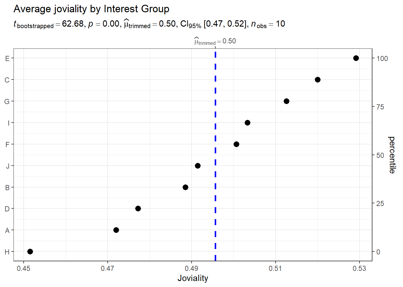
To understand which interest group that participants joined has the highest joviality, we used the average joviality of each interest group.
Observation: Interest group E has the highest joviality compared to others, with an average 0.53 and Interest group H has the lowest joviality with an average 0.45.
merged_table_joviality <- merged_table %>%
  select(participantId, interestGroup, joviality) %>%
  group_by(interestGroup)

merged_table_joviality <- unique(merged_table_joviality)

merged_table_joviality <- merged_table_joviality %>%
  group_by(interestGroup) %>%
  mutate(average_joviality = mean(joviality)) %>%
  select(interestGroup, average_joviality) %>%
  distinct()


ggdotplotstats(data = merged_table_joviality,
               y = interestGroup,
               x = average_joviality,
               type = "robust",
               title = "Average joviality by Interest Group",
               xlab = "Joviality",
               ggtheme = theme_bw())
Average joviality vs. interest group vs. age_group
To see whether interest group and joviality is affected by age_group
 merged_table_joviality_age_group <- merged_table %>%
  select(participantId, age_group,joviality, interestGroup) %>%
  group_by(interestGroup, age_group) %>%
  mutate(average_joviality = mean(joviality))%>%
  distinct() %>%
  select(age_group, interestGroup, average_joviality)

tooltip <- function(y, ymax, accuracy = .01) {
  mean <- scales::number(y, accuracy = accuracy)
  sem <- scales::number(ymax - y, accuracy = accuracy)
  paste("Mean joviality:", mean, "+/-", sem)
}

gg_point <- ggplot(data=merged_table_joviality_age_group,
                   aes(x = reorder(interestGroup,age_group)),
) +
  stat_summary(aes(y = average_joviality,
                   tooltip = after_stat(
                     tooltip(y, ymax))),
    fun.data = "mean_se",
    geom = GeomInteractiveCol,
    fill = "lightblue"

  ) +
  stat_summary(aes(y = average_joviality),
    fun.data = mean_se,
    geom = "errorbar", width = 0.2, size = 0.2
  ) +
  facet_wrap(~age_group)+
  coord_flip()+
  theme_bw() +

  theme(legend.position = "none") +
  theme(panel.grid = element_blank()) +
  labs(title = "Average joviality by Interest group by age",
       y = "Average Joviality",
       x = "Interest Group")

girafe(ggobj = gg_point,
       width_svg = 8,
       height_svg = 8*0.618)
To see whether interest group and joviality is affected by wage_group
merged_table_joviality_wage_group <- merged_table %>%
  select(participantId, wage_group,joviality, interestGroup) %>%
  group_by(interestGroup, wage_group) %>%
  mutate(average_joviality = mean(joviality))%>%
  distinct() %>%
  select(wage_group, interestGroup, average_joviality)

tooltip <- function(y, ymax, accuracy = .01) {
  mean <- scales::number(y, accuracy = accuracy)
  sem <- scales::number(ymax - y, accuracy = accuracy)
  paste("Mean joviality:", mean, "+/-", sem)
}

gg_point <- ggplot(data=merged_table_joviality_wage_group,
                   aes(x = reorder(interestGroup,wage_group)),
) +
  stat_summary(aes(y = average_joviality,
                   tooltip = after_stat(
                     tooltip(y, ymax))),
    fun.data = "mean_se",
    geom = GeomInteractiveCol,
    fill = "lightblue"

  ) +
  stat_summary(aes(y = average_joviality),
    fun.data = mean_se,
    geom = "errorbar", width = 0.2, size = 0.2
  ) +
  facet_wrap(~wage_group)+
  coord_flip()+
  theme_bw() +

  theme(legend.position = "none") +
  theme(panel.grid = element_blank()) +
  labs(title = "Average joviality by Interest group by age",
       y = "Average Joviality",
       x = "Interest Group")

girafe(ggobj = gg_point,
       width_svg = 8,
       height_svg = 8*0.618)
Interest group I is dominated among 39-46 age group and super low wage group. Super Low income seems to enjoy the most and participate most in Interest group. However, for those super high income group, their source of happiness doesn’t come from interest group and they participate least in interest group.
Joviality
Correlation between savings and joviality
Does it mean the more you earn, the happier you are?
Let’s find out from below correlation plot:
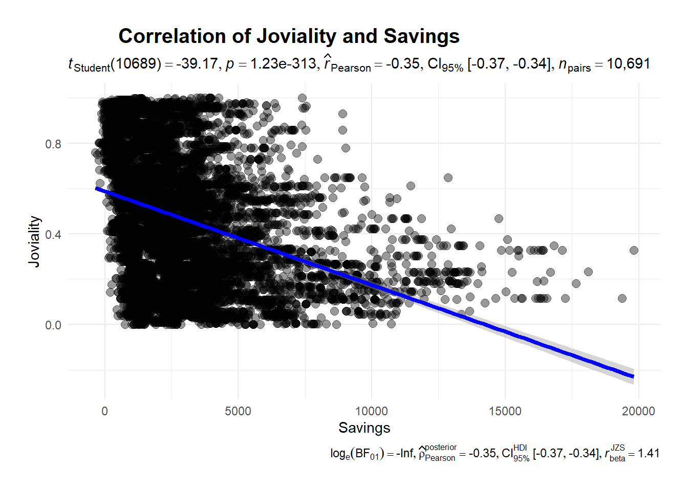
ggscatterstats(
 data = merged_table,
x = Savings,
y = joviality,
marginal = FALSE) +

  theme_minimal() +

  labs(title = 'Correlation of Joviality and Savings', x = "Savings", y = "Joviality") +

theme(
        plot.title = element_text(hjust = 0.2, size = 15, face = 'bold'),
        plot.margin = margin(20, 20, 20, 20),
        legend.position = "bottom")
There’s a negative relationship between joviality and savings. The more savings you have the less happy you are, which suggested that money cannot guarantee your happiness.
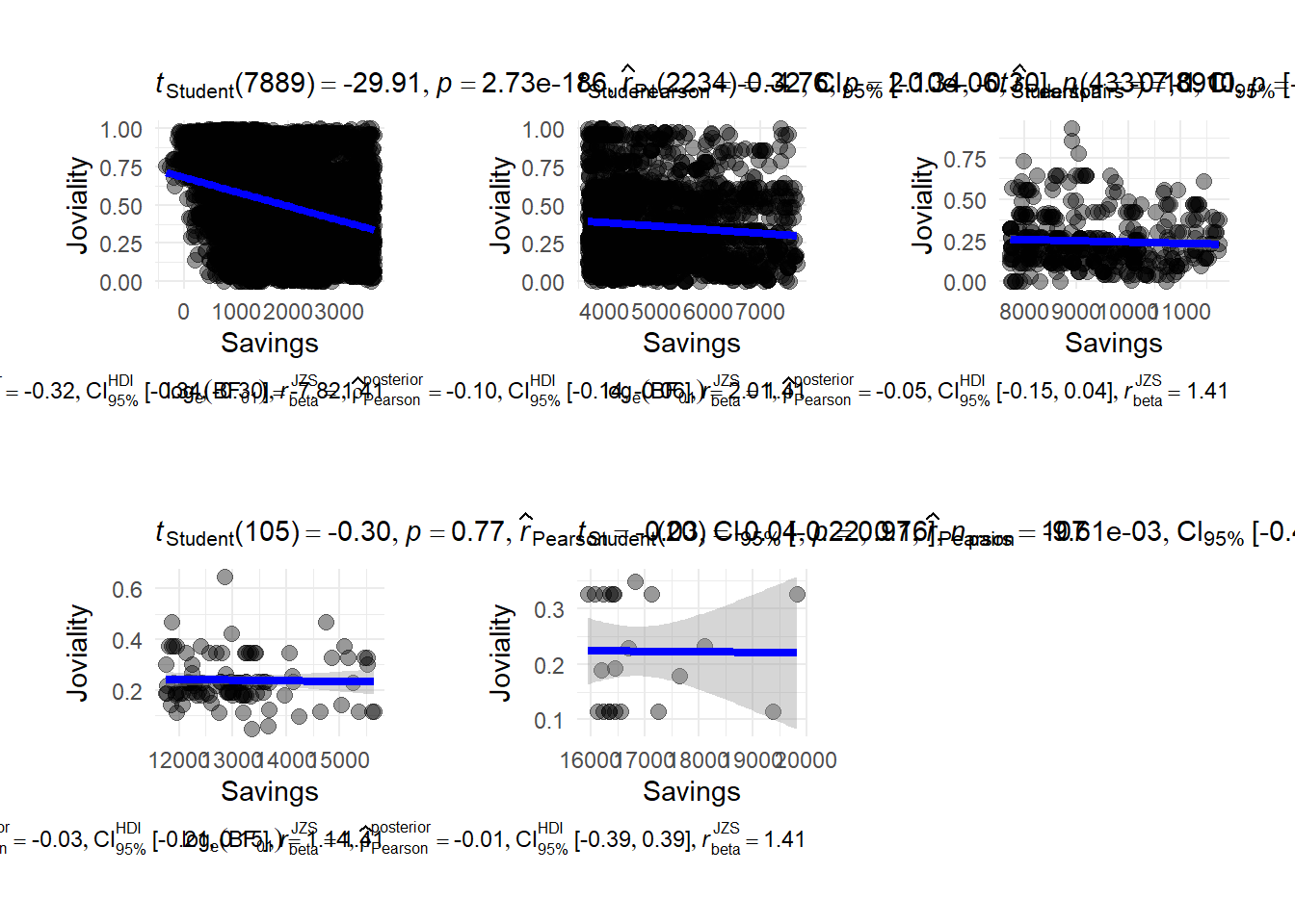
To have a closer look on which savings group have a higher joviality, we plot correlation between savings group. We break savings into 5 groups (super low, low, medium, high, super high) There is a strong negative correlation when people has a super low financial health.
p1 <- ggscatterstats(
 data = merged_table |>filter(savings_group == "super low"),
x = Savings,
y = joviality,
marginal = FALSE) +

  theme_minimal() +

  labs(x = "Savings", y = "Joviality") +

theme(
        plot.title = element_text(hjust = 0.2, size = 15, face = 'bold'),
        plot.margin = margin(20, 20, 20, 20),
        legend.position = "bottom")

p2 <- ggscatterstats(
 data = merged_table |>filter(savings_group == "low"),
x = Savings,
y = joviality,
marginal = FALSE) +

  theme_minimal() +

  labs(x = "Savings", y = "Joviality") +

theme(
        plot.title = element_text(hjust = 0.2, size = 15, face = 'bold'),
        plot.margin = margin(20, 20, 20, 20),
        legend.position = "bottom")

p3 <- ggscatterstats(
 data = merged_table |>filter(savings_group == "medium"),
x = Savings,
y = joviality,
marginal = FALSE) +

  theme_minimal() +

  labs(x = "Savings", y = "Joviality") +

theme(
        plot.title = element_text(hjust = 0.2, size = 15, face = 'bold'),
        plot.margin = margin(20, 20, 20, 20),
        legend.position = "bottom")

p4 <- ggscatterstats(
 data = merged_table |>filter(savings_group == "high"),
x = Savings,
y = joviality,
marginal = FALSE) +

  theme_minimal() +

  labs(x = "Savings", y = "Joviality") +

theme(plot.title = element_text(hjust = 0.2, size = 15, face = 'bold'),
        plot.margin = margin(20, 20, 20, 20),
        legend.position = "bottom")

p5 <- ggscatterstats(
 data = merged_table |>filter(savings_group == "super high"),
x = Savings,
y = joviality,
marginal = FALSE) +

  theme_minimal() +

  labs(x = "Savings", y = "Joviality") +

theme(
        plot.title = element_text(hjust = 0.2, size = 15, face = 'bold'),
        plot.margin = margin(20, 20, 20, 20),
        legend.position = "bottom")

p1 + p2 + p3 + p4 + p5
It is interesting to note that individuals with super low income who exhibit remarkably highest average joviality scores of 0.75. Joviality exhibits a stronger negative correlation with lower income levels compared to wealthier individuals.
Comparison between joviality and haveKids
Does it mean having children bring more joy to life?
It seems that residents who don’t have kids are slightly more happy than those who have kids with an average joviality 0.475.
merged_table_joviality_kids <- merged_table %>%
  select(haveKids,joviality) %>%
  group_by(haveKids)%>%
  summarise(average_joviality = mean(joviality))

p <- ggplot(data = merged_table_joviality_kids, aes(x = haveKids, y = average_joviality, fill = haveKids)) +
  geom_bar(stat = "identity", position = "dodge") +
  labs(x = "Have Kids", y = "Joviality") +
  ggtitle("Joviality Levels by Having Kids") +
  theme_minimal()
ggplotly(p)
Highlights
1. To examine the happiness levels of participants throughout the study, it would be more insightful to collect joviality data both at the beginning and end of the study. This would provide a comprehensive understanding of how participants’ moods evolve over time. Such information would be valuable for analysts to identify factors influencing joviality.
2. Considering that individuals with children tend to have lower joviality levels compared to those without children, it may not be necessary for the city council to actively encourage residents to delay their plans for having children. Furthermore, we recommend that city councillors reconsider the allocation of funds towards education, as higher educational attainment is associated with increased wages but can have an inverse effect on happiness.
3. As the number of family members decreases, so do shelter costs. Consequently, residents with larger households may require financial assistance from the city council to cover housing expenses. Therefore, we suggest that city councillors allocate funds to support housing for households with greater size.
4. It is advisable to encourage participants with lower educational degrees to pursue high-school or college degrees. This would support their personal and professional growth, potentially leading to improved opportunities and well-being.